This article is not about finding the winner of a colour popularity contest in a call to action design. You also won’t learn the best colour for landing pages in order to increase your conversion rates. What you will learn however, is that there is no mysterious recipe needed for every situation. You will learn that the ‘secret’ is not using a certain colour, but knowing when, why and how to select a colour that can work effectively for a certain type of audience, based on a solid analysis of each particular situation.
If you have reached the point where you need to choose a CTA (call to action) colour for your new campaign/landing page, this post can help you rationalise every step you need to take to ensure you are making the best possible decision for your brand.
Colour is the property of an object to produce visual perceptions on the eyes that are interpreted by your brain, as a result of how it reflects or emits light. Sounds complicated, right? To put it in simple terms: the light receptors in your eyes detect electromagnetic radiation, the brain then interprets that information and you are able to see the light spectrum of each object.
Despite the fact human eyes can see nearly 10 million shades of colours, we are limited and can only see the Visible Spectrum of light. A human eye will detect wavelengths from 390 to 700 nm with frequencies of 430–770 THz. One important aspect to remember is the fact colour is a matter of perception. Two human beings may perceive the same object/colour differently based on both physical and psychological factors.
The use of colour in web design has changed over the years. When the internet was in its early stages, people used to experiment frequently. On many occasions, people would break and push the boundaries of colour theory and composition.
It hasn’t always resulted in great designs, but it enabled experiments to be made and for us to have a better understanding of how user interfaces best work and how we can use every single aspect of design to influence the user experience. Design has evolved, and now user interface design has become a much more precise field, with certain rules and guidelines that the previous experimentation years made possible. It would be nearly impossible to analyse all the colours used in CTA’s on the internet, as that would require a huge amount of resources, so we will only concentrate on the ones that are used most often.
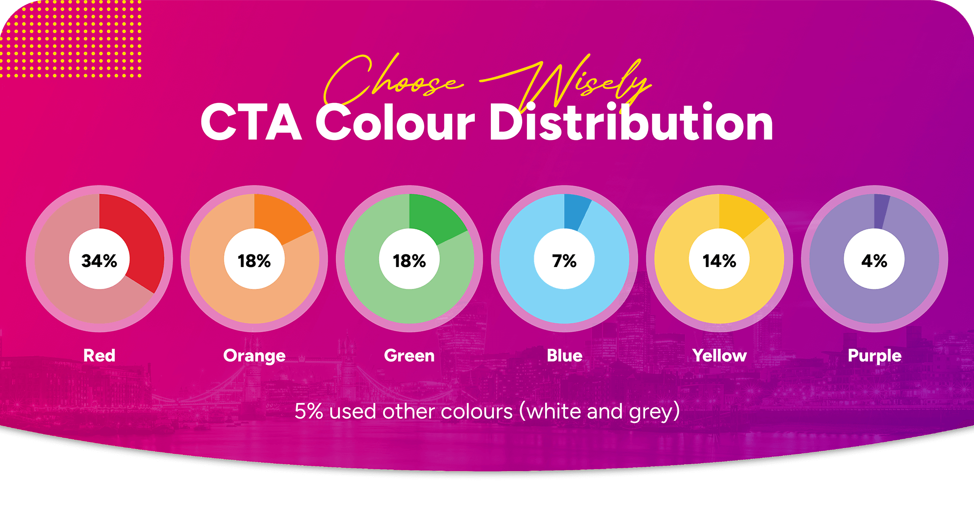
In a study completed by Chartboost regarding the selection of colours for CTA’s, they analysed the distribution of colours in CTA buttons for the top 200 global ad creatives. The results can be used to better understand which are the most commonly used CTA button colours worldwide. Clearly, the most used colours are red, green and orange, with yellow, blue and purple following closely. A much lower percentage are using colours like grey, white and black.
Psychology of colour – things are more complex than the generic perception of blue meaning security and red indicating stop.
So let’s focus on the most used CTA colours: red, green, orange, blue, yellow and purple. Basic colour psychology can tell us more about each of these colours:
Red, the colour of blood can be associated with energy, speed, strength, love, power, but also war, danger and anger.
Orange combines the energy and speed of red with the joy of yellow. Orange can communicate happiness, creativity and enthusiasm.
Green is the colour of nature. It communicates growth, freshness, safety, trust, stability. Green is commonly associated with finances and ‘green’ products.
Blue is the colour of the sky and it symbolises trust, wisdom, confidence and truth. Statistics also say blue is a masculine colour, as more than 57% of males prefer it.
Yellow is the colour of the sun. It often associated with energy, happiness, warmth and innovation. Yellow is perceived as a playful and cheerful colour.
Purple combines features from both red and blue, being associated with energy and stability, but also royalty. It can communicate power, luxury and wealth.
These are just some very rough psychological properties of colours. Things are far more complex than that. Colour psychology also depends on other factors that greatly influence the emotion generated by a certain colour. Let’s take the colour red for example. In the western world, the colour symbolises energy, love, passion and anger, in China, it symbolises good luck, vitality and long life, in India purity, fertility and beauty while in South Africa, for example, it’s the colour of mourning.
This illustrates how the same colour can invoke different emotions to different people. This is why we need to define your target audience before choosing a colour for your CTA. The good news is there are loads of colours to choose from and you can start by excluding colours that might not work for your audience.
So after careful consideration of your target market and a solid analysis of your product and conversion funnel, you finally chose a new colour to test against your current design.
Before rushing into adding it to your landing page, please consider one important aspect: it will only work if it stands out from the rest of the elements on the landing page! For that to happen, we need to make sure your CTA colour is not used as a predominant colour for the rest of the landing page. Just imagine your landing page has a background image with a predominant red area. If your new CTA colour is red as well, its likely that it won’t work very well for you. You could consider changing the image or the new CTA colour.
A recent study has shown that 92.6% of people say the visual dimensions are the number one influencing factor that affects their purchase decision. You generally only have 90 seconds to convince a user to make a subconscious judgement about a product.
That is why we must always make sure the CTA is ‘isolated’ by a certain amount of white space, so we can draw the user’s attention towards it and make sure the colour is in contrast with the rest of the page. Don’t just rely on the fact that the user ‘can find it’ in your page. Most users will bounce off your page if they do not find what they are looking for quickly.
Don’t fall into the trap of thinking ‘it’s just a colour, what can possibly be the outcome of simply changing a CTA colour?’ A lot of companies design beautiful landing pages, putting a lot of thought into each aspect, yet fail to test & improve one single aspect: the CTA (both copy & colour).
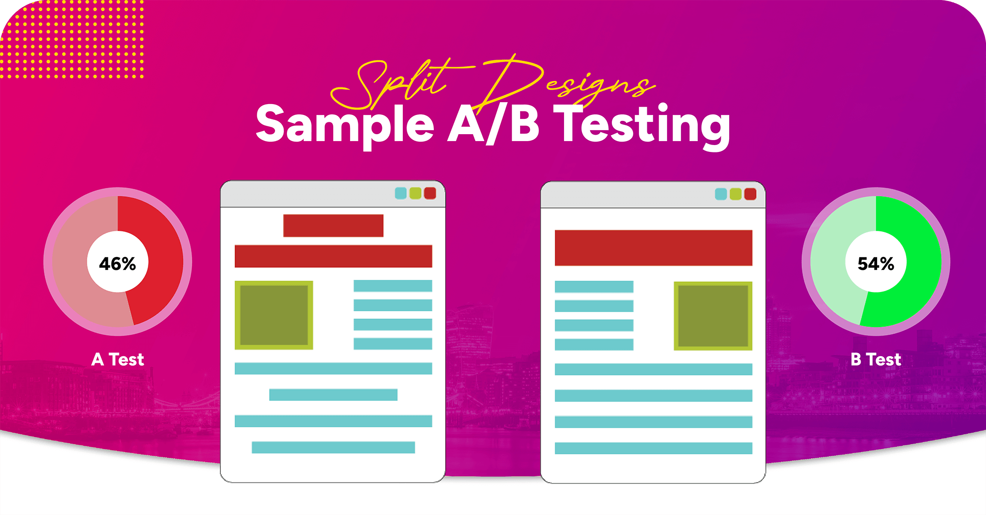
One of the ways you can determine whether your new CTA colour works is by conducting an A/B test. Let’s take Performable for example, which conducted a simple A/B test by changing the colour of their CTA and concluding that in their case, red beats green by 21%. Other tests have shown that green can outperform red and that green beats orange by 6.3%. It really is a matter of adapting the best colour for a certain target audience. So which colour should you use? The answer is simple: the one that works best for your scenario. Don’t just take my word for it. Test it!
If you or your business would like to know more about creating high-quality landing pages, then make sure you get in touch with a friendly member of our digital marketing agency team here at Absolute Digital Media, all you need to do is call us today on 0800 088 6000.